OKX
Streamlining a Crypto Exchange's Multi-Factor Authentication
ROLE
▸ Lead UX designer on the MFA project for a duration of 10 months
▸ Refined problem scopes, conceptualized design solutions, mapped scenario-based user flows, and ensured design handoff and was involved in UAT
YEAR
▸ 2016 - 2018
Given the high stakes associated with cryptocurrency, holders are constantly under threats like phishing and cybercrimes. This underscores the importance of Multi-Factor Authentication (MFA) in safeguarding users' accounts and their assets. However, the user experience was previously compromised due to incomplete MFA journey, leading to challenges in login-related issues and MFA adaptability.

OKX, a leading cryptocurrency exchange with high trading volumes, serves millions across 100+ countries, aiming to revolutionize finance and empower individuals worldwide by offering comprehensive tools for strategic trading and investment.
PROBLEMS ■
On the OKX platform, sensitive actions like logging in or withdrawing assets require verification steps, including inputting codes from mobile phones, emails, or an authenticator app. The more critical the task, the more layers of verification are demanded. In collaboration with product managers and the customer service team, I identified several login setbacks faced by users:
Login Roadblocks
Users who no longer had access to their registered phone number, email, or authenticator app struggled to perform MFA for login, as the platform didn't provide a clear way to address this issue.
User Preferences and Security Trade-Offs
Users preferred mobile numbers and email authentication for its convenience, but these channels were more vulnerable to phishing threats. In contrast, the Authenticator app offered enhanced security, yet its complex setup posed restoration challenges.
Given the user challenges, the previous design didn't accommodate exceptional scenarios effectively, which limited users' ability to use alternative methods for retrieving and entering authentication codes. As a result, many were blocked from logging into the platform and failed to perform their intended activities.
GOALS ■
To address the aforementioned issues, I crafted the following goals that captured both the user and business perspectives.
From a User's Perspective:
▸ Streamlined the MFA management process, encompassing setup, updates, and recovery, ensuring it was smooth and intuitive.
▸ Enhanced account security while ensuring users could proceed with their intended activities seamlessly.
From a Business Perspective:
▸ Optimized account operations to support the surge in business expansion.
DESIGN PROCESS ■
Recognizing that usability issues were the bottleneck of the existing MFA design, I leveraged Jakob Nielsen's 10 Usability Heuristics for interaction design, a well-renowned set of principles, to guide my design process. I applied these principles to four critical MFA journey touchpoints to ensure both user satisfaction and alignment with business objectives:
Journey 1 - Switching Alternative MFA Methods During Login
Journey 2 - Setting Up and Updating Authenticator App Connections
Journey 3 - Modifying MFA Settings in the Security Centre
JOURNEY 1 ■
Switching Alternative MFA Methods During Login.
Previous Design
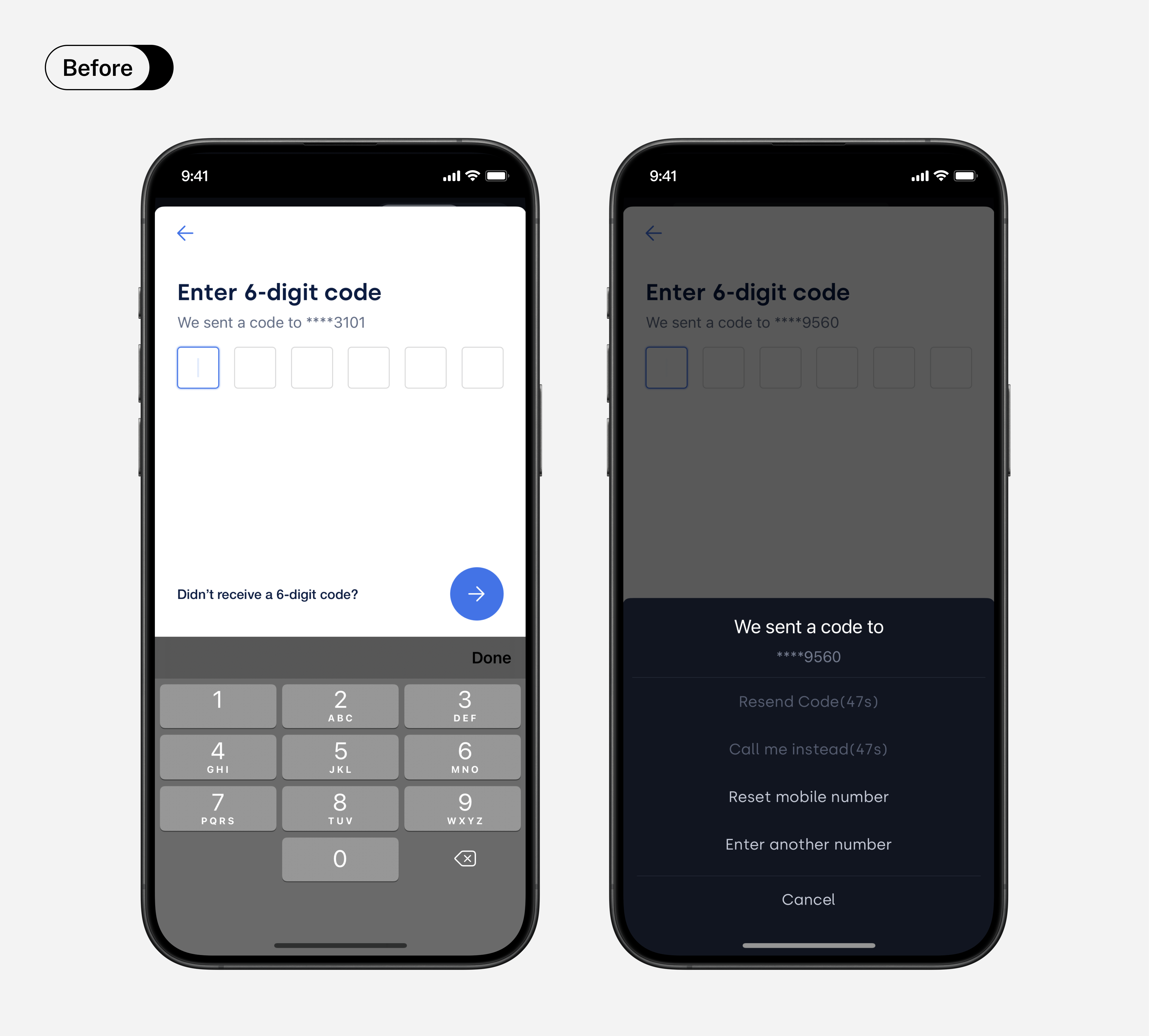
When users faced difficulties entering the mobile verification code, the button labeled "Didn't receive a 6-digit code" obscured the availability of other options. Furthermore, the "reset mobile number" option lacked adequate context, potentially leading users towards unintended actions.
Refined Design
▸ Clear Labels and Instructions
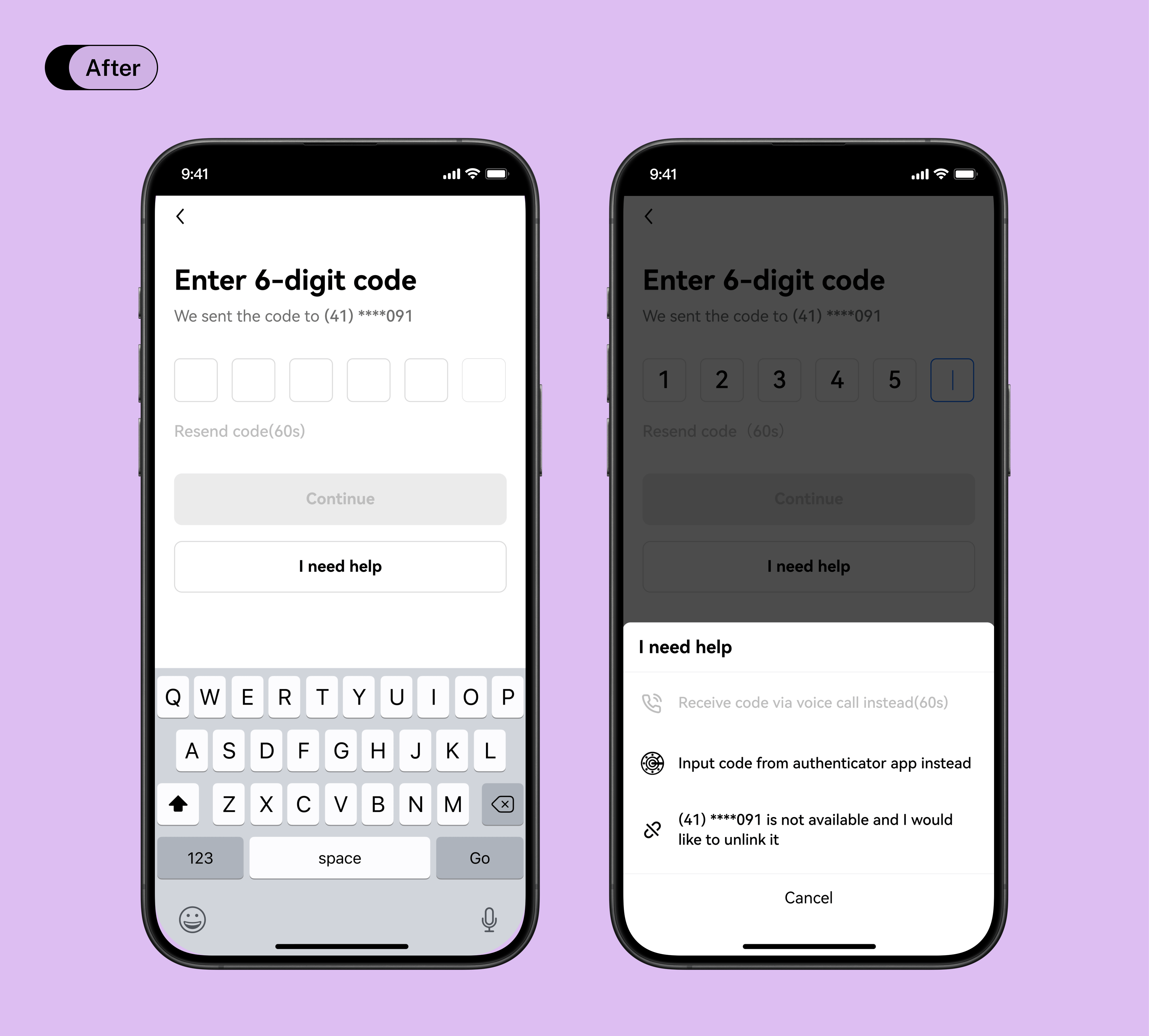
Collaboration with a UX writer led to a refinement of copy, providing clearer context and instructions, ensuring users understood the consequences of their actions and could confidently make decisions.
▸ Improved Button Recognition
By repositioning and regrouping related action buttons with icons, users were readily presented with a clearer view of all available options, reducing reliance on memory.
JOURNEY 2 ■
Setting Up and Updating Authenticator App Connections.
Previous Design
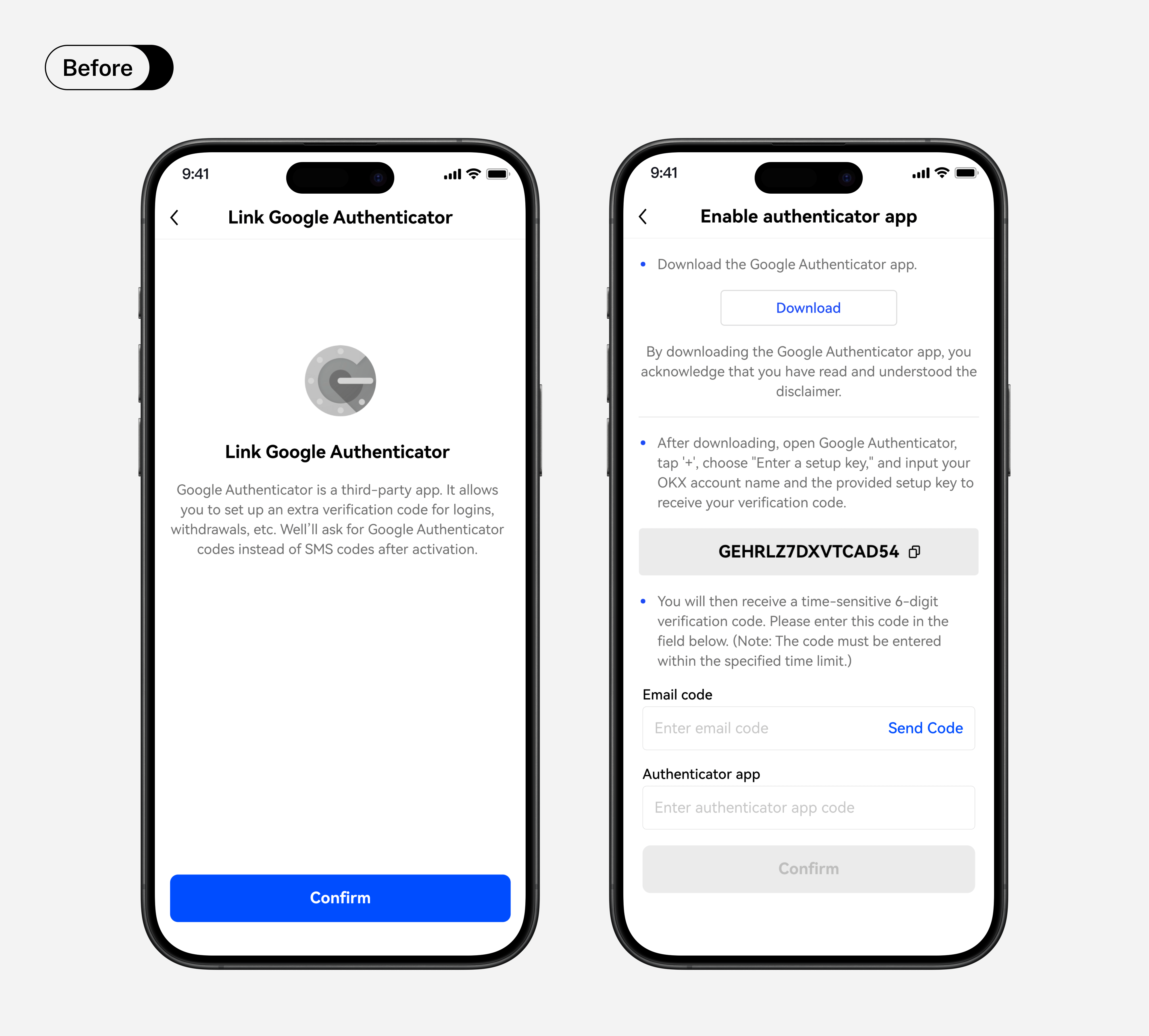
▸ Overheming information
While setup instructions were provided, the cluttered presentation didn't effectively convey the benefits of enabling the Authenticator App connection.
▸ Absence of recovery reminder
This oversight poses a risk, as recovering the authentication method becomes challenging if users lose access to the authenticator app.
Refined Design
▸ Breaking Complex Information into Digestible Chunks
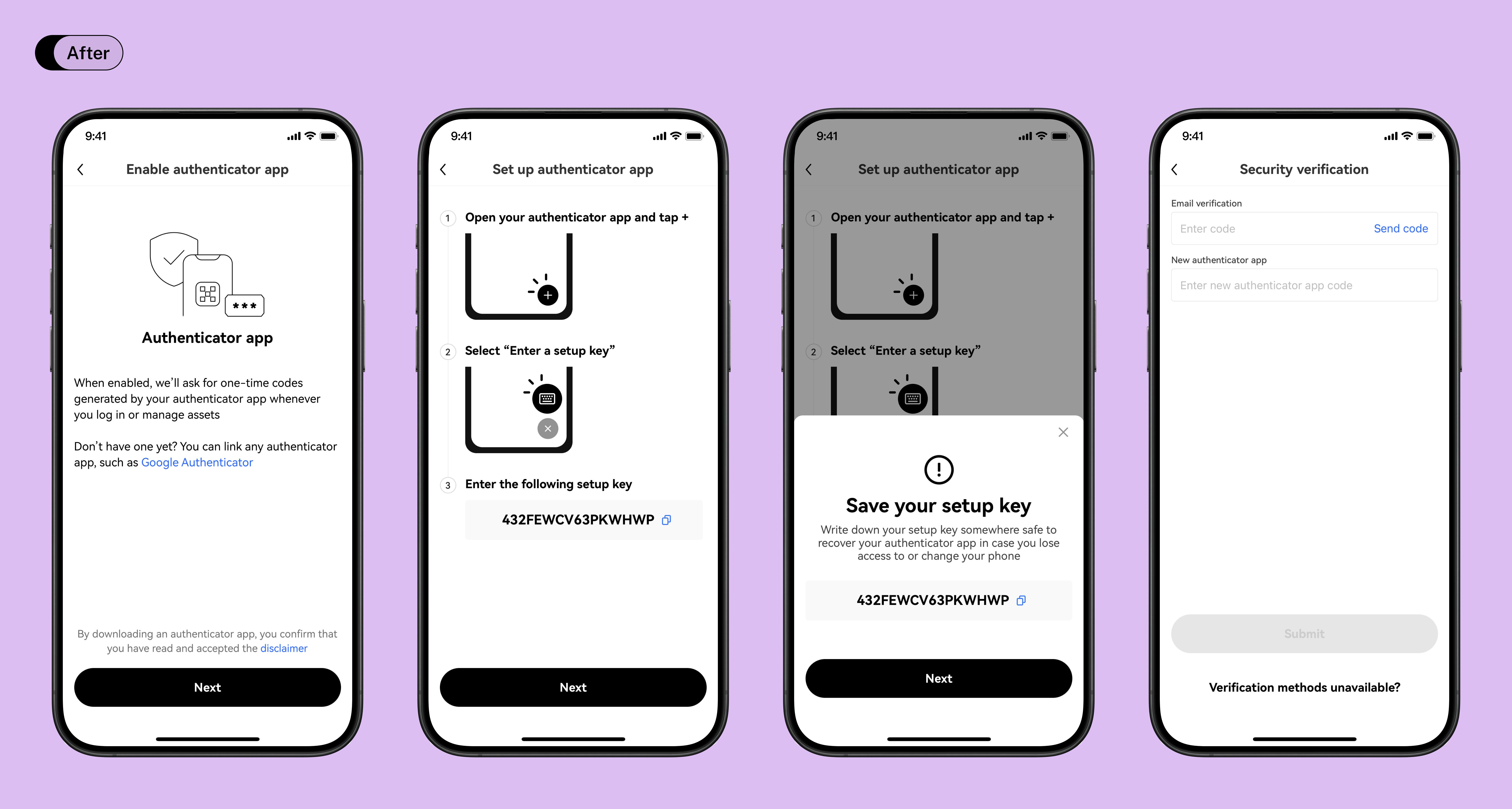
The setup journey was segmented into several pages: the first page emphasized the benefits, the second offered a detailed guide with illustrations, and the last step required users to input MFA codes for confirmation.
▸ Timely Reminder for Setup Key Storage
Alerts were introduced during the setup process, highlighting the importance and consequences of improper storage.
JOURNEY 3 ■
Modifying MFA Settings in the Security Centre.
Previous Design
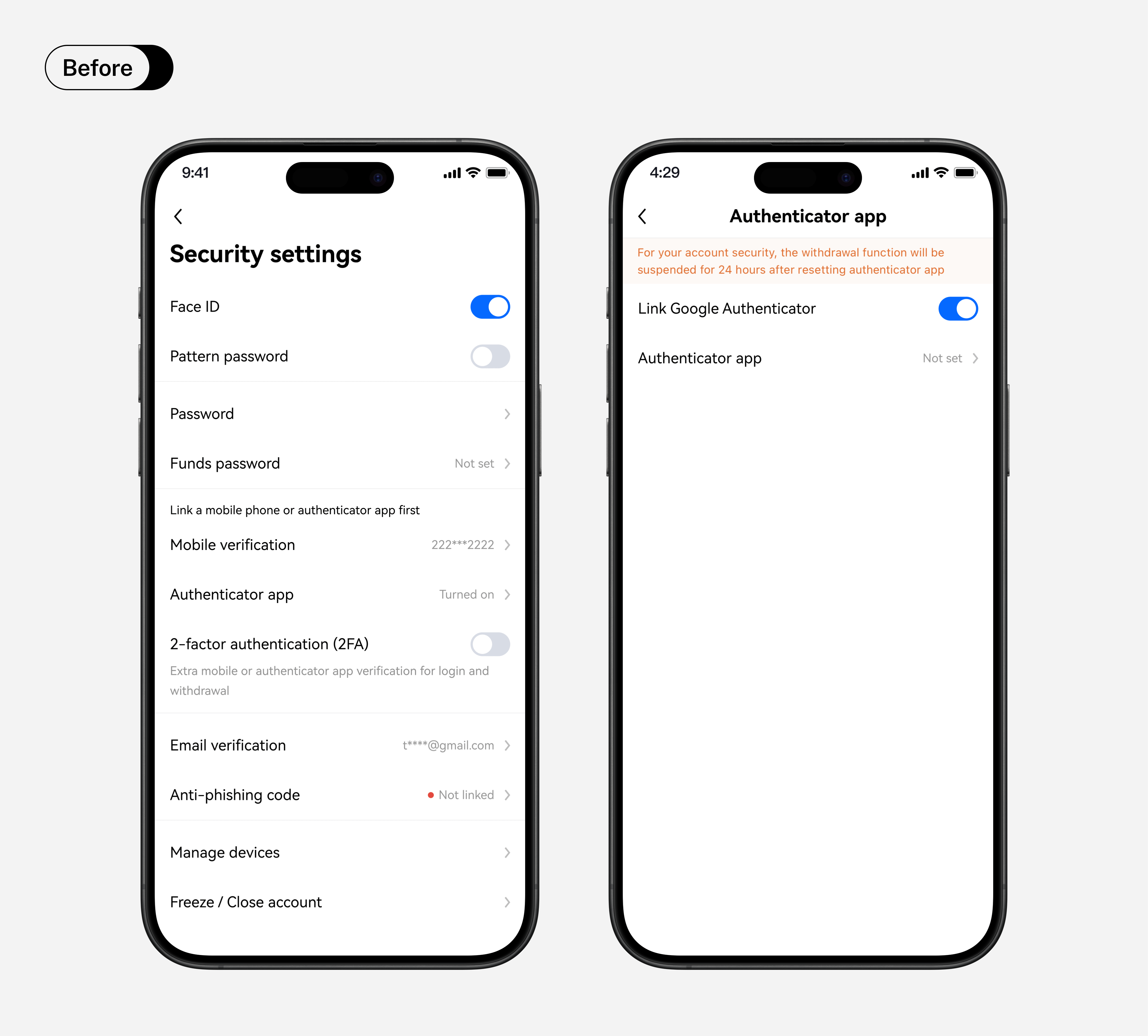
▸ Inconsistent Status Indicators
A mix of toggle buttons, "turned on" labels, and red dots created visual clutter and inconsistency.
▸ Confusion in MFA Options Placement
The MFA prerequisite step was ambiguously positioned, making mobile, email, and authenticator app authentication less prominent.
▸ Text-Dense Interface
An overwhelming amount of text hindered efficient information processing and created UI complications during multiple language translations.
Refined Design
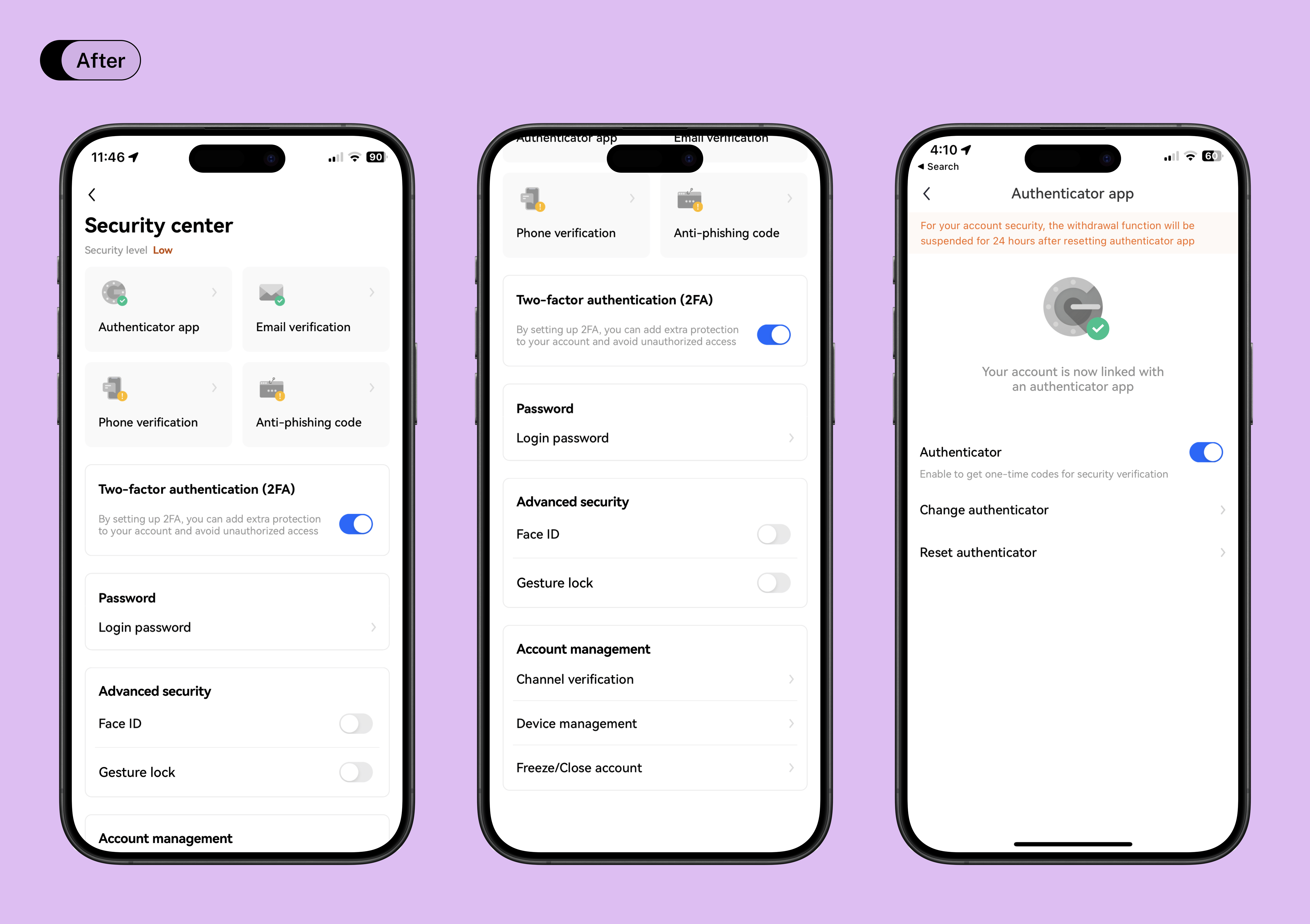
▸ Unified Status Indicators
Reduced variety of indicators for a cleaner look.
▸ Prioritized MFA
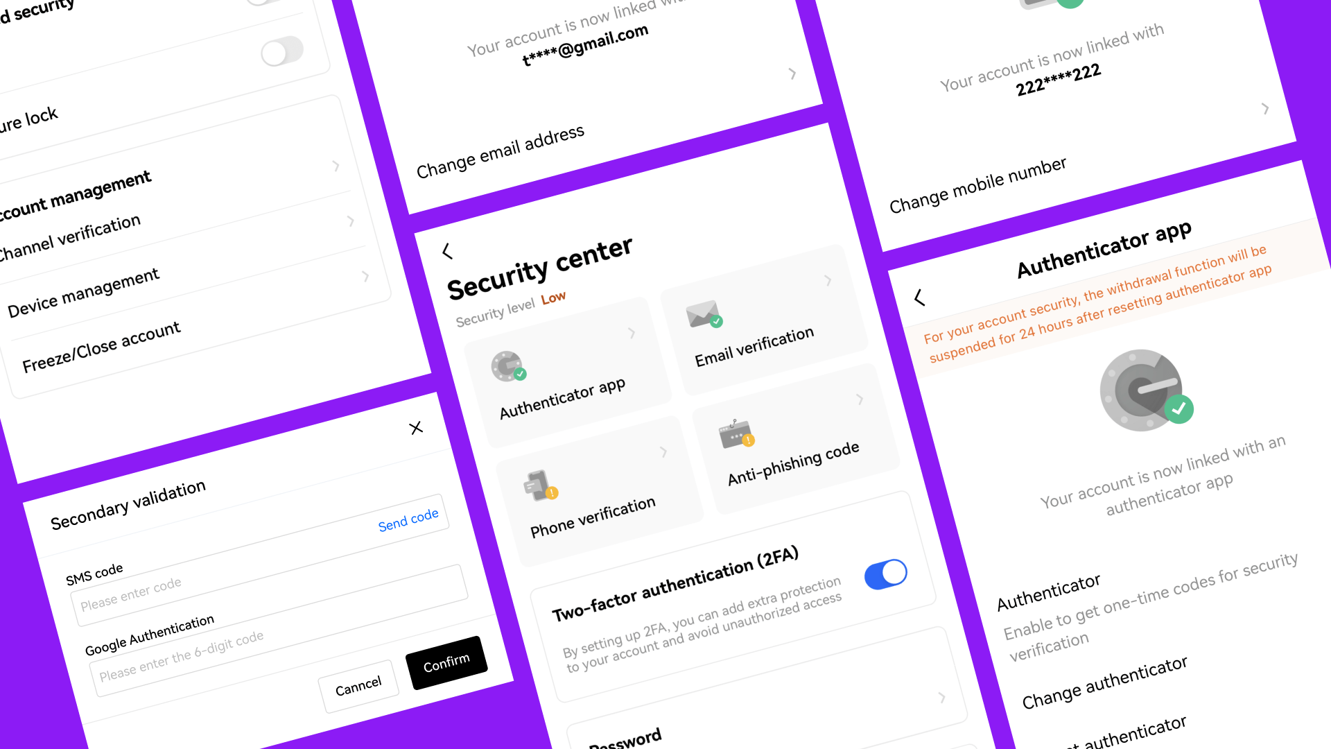
MFA options are now prominently displayed at the top, complemented by distinct visuals, highlighting their importance.
▸ Structured Grouping
Grouped related settings and redirected some details to sub-pages, reducing cognitive load and enhancing scannability. Reduced text to address overflow issues from lengthy translations.
Through diligent efforts and user-centric design, the outcomes of this project benefit both users and the business in significant ways.
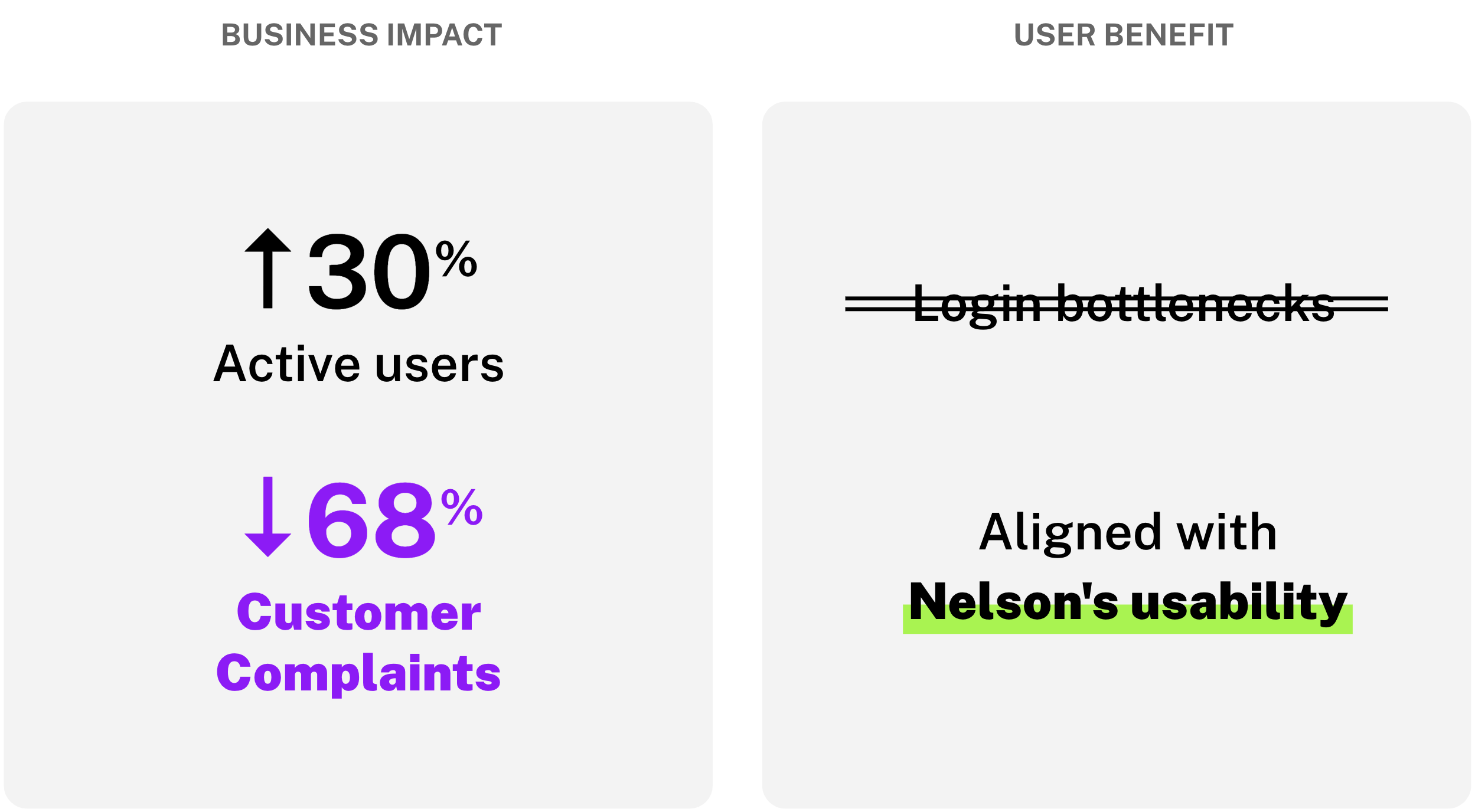
Notable Business Impact
Amidst a 30%+ surge in active users, CS complaints dropped by 68.4%. Refined security centre paves the way for long-term security adoption.
User Benefit
Removed login setbacks induced by Multi-Factor Authentication (MFA).
LIMITATIONS & TAKEAWAYS ■
Rethinking UX Strategies in a Dynamic Industry
Conventional design methods and workflows can be challenging to fully implement in real-world scenarios. I conducted a critical evaluation to determine which UX methods were most suitable for the situation. This led me to explore adaptable approaches that maintained a user-centered design focus within constraints, including UX audit of the MFA journeys and applying Nielsen's usability principles to the design
Integrating User Feedback into Design Amid Constraints
Existing users often expressed concerns about phishing and fraud, making it challenging to approach them. Time constraints added further difficulties to the recruitment of authentic users. To address this, I explored alternative methods that align with user-centric design principles, such as working closely with the CS team to gather common user pain points.


