Designing for Scale: A Unified System for a Financial News Experience
Designing for Scale: A Unified System for a Financial News Experience
Designing for Scale: A Unified System for a Financial News Experience
As part of launching a new financial news platform across web and native apps, I led the refinement of a design system that supported a distinct brand identity while maintaining visual coherence with the parent company’s design language.
Continuing work from an earlier setup, I restructured and scaled the design system to improve usability, consistency, and collaboration. This included organizing the component library, redefining file structures, and migrating the workflow from Sketch to Figma.
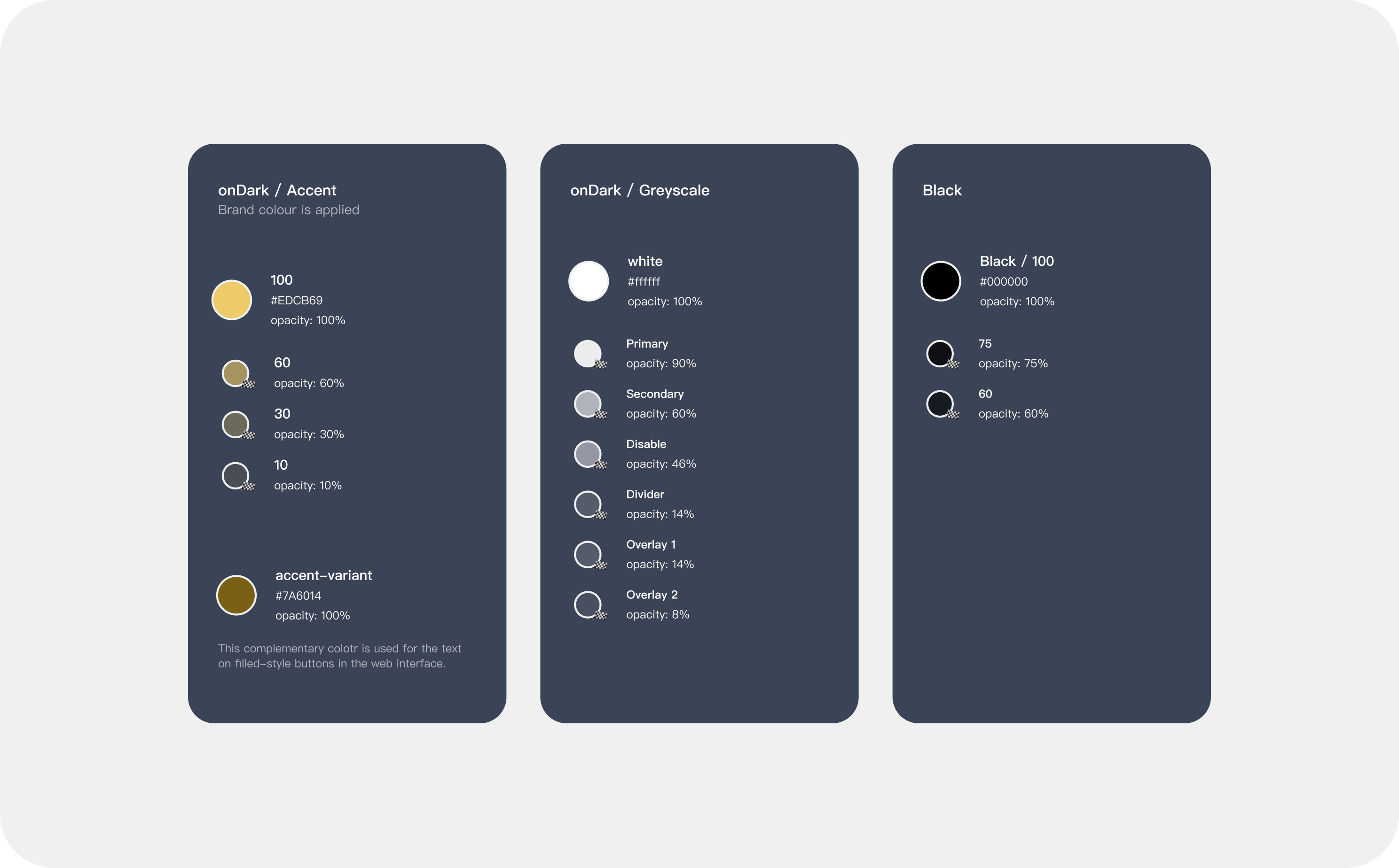
Accessibility was a key focus throughout the process. I incorporated WCAG 2.1 guidelines and optimized typography and color contrast to ensure readability and usability—particularly for our mature audience.
The system enabled smoother cross-platform design, reduced duplication, and created a more maintainable foundation for a team of designers working in parallel.
As part of launching a new financial news platform across web and native apps, I led the refinement of a design system that supported a distinct brand identity while maintaining visual coherence with the parent company’s design language.
Continuing work from an earlier setup, I restructured and scaled the design system to improve usability, consistency, and collaboration. This included organizing the component library, redefining file structures, and migrating the workflow from Sketch to Figma.
Accessibility was a key focus throughout the process. I incorporated WCAG 2.1 guidelines and optimized typography and color contrast to ensure readability and usability—particularly for our mature audience.
The system enabled smoother cross-platform design, reduced duplication, and created a more maintainable foundation for a team of designers working in parallel.
IMPACT ■
Reduced duplicated components by over 40%, creating a cleaner, more scalable design system.
Reduced duplicated components by over 40%, creating a cleaner, more scalable design system.
Reduced duplicated components by over 40%, creating a cleaner, more scalable design system.

Cut handoff time by 50% with a more structured system and clear design specifications.
Cut handoff time by 50% with a more structured system and clear design specifications.
Cut handoff time by 50% with a more structured system and clear design specifications.

Migrated all design files from Sketch to Figma, enabling real-time collaboration and better version control.
Migrated all design files from Sketch to Figma, enabling real-time collaboration and better version control.
Migrated all design files from Sketch to Figma, enabling real-time collaboration and better version control.
Migrated all design files from Sketch to Figma, enabling real-time collaboration and better version control.

Enabled faster product iteration, helping teams deliver final designs up to 2× faster than before.
Enabled faster product iteration, helping teams deliver final designs up to 2× faster than before.
Enabled faster product iteration, helping teams deliver final designs up to 2× faster than before.
CHALLENGE & OPPORTUNITY ■
With the product still in early development, this was perfect timing to systematize design practices.
New Brand, Fresh Foundation
The team faced the dual challenge of implementing a new brand identity while building a scalable design foundation across web and mobile platforms. A deliberate decision was made to avoid using the component library from the parent product, enabling the creation of a system optimized for the new product's unique requirements and future scalability.
Collaborative Evolution
The transition to Figma represented more than a tool change—it was a strategic shift to advance design tooling capabilities through real-time collaboration, centralized component libraries, and robust version control. These technological improvements were essential for maintaining quality while supporting the company's business growth and scaling design operations.
KEY JOURNEY ■
Accelerating Cross-Platform Content Delivery
Accelerating Cross-Platform Content Delivery
Accelerating Cross-Platform Content Delivery
Accelerating Cross-Platform Content Delivery
Accelerating Cross-Platform Content Delivery
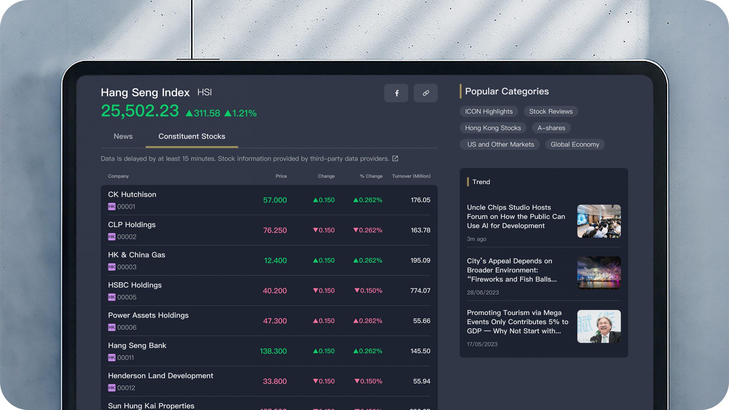
Structured with Rhythm. Financial dashboard presenting complex market data through a systematic grid layout, clear typography hierarchy, and color-coded status indicators.
Designed for Reading Comfort. News article view demonstrating how shared visual language supports accessibility and readability in long-form editorial content, while maintaining brand consistency.
Accelerating Financial Decision-Making
Accelerating Financial Decision-Making
Accelerating Financial Decision-Making
Accelerating Financial Decision-Making
Accelerating Financial Decision-Making
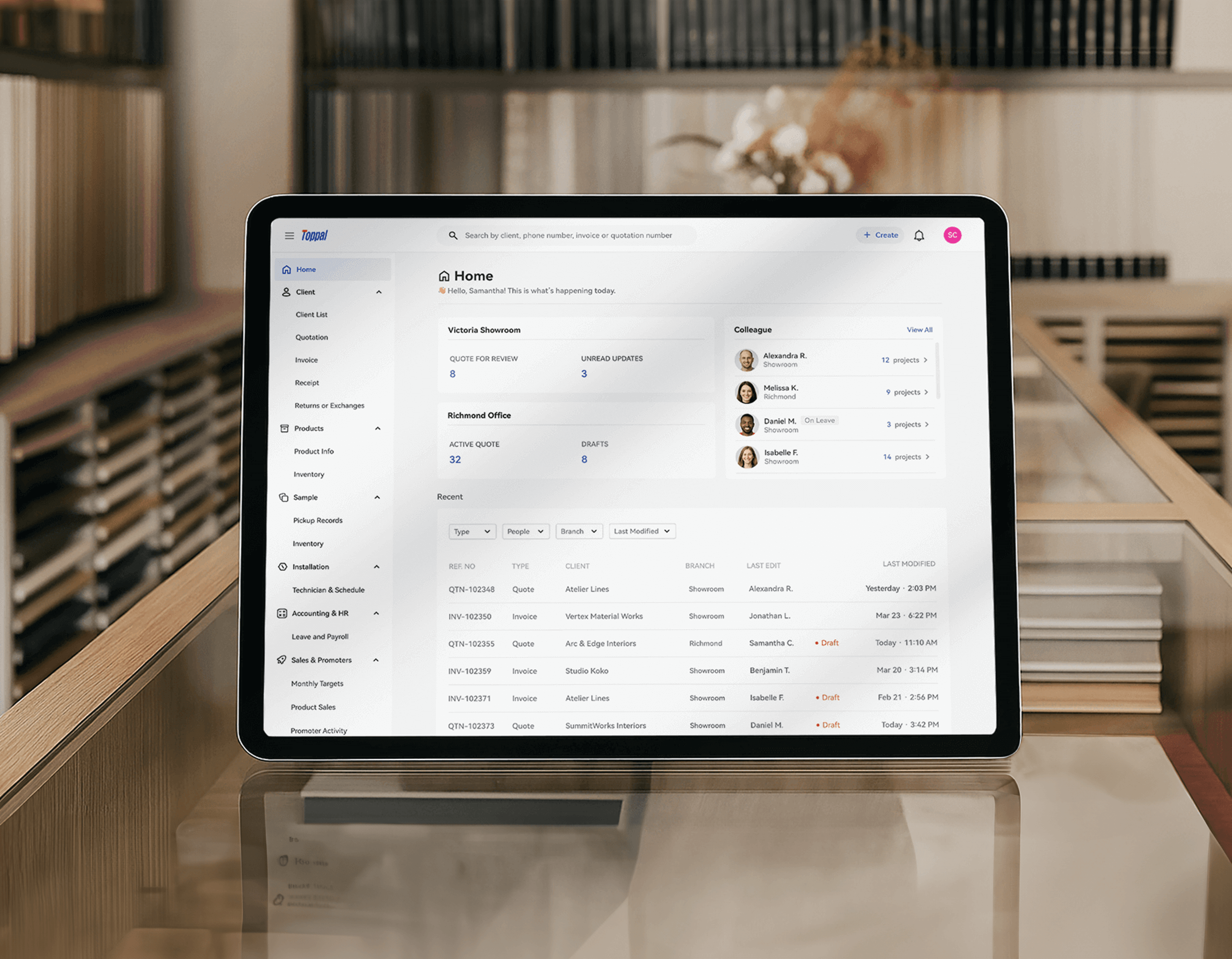
Information-Dense Layouts. Home page organized for rapid information scanning, demonstrating how the foundational components enabled efficient creation of this information-rich interface.
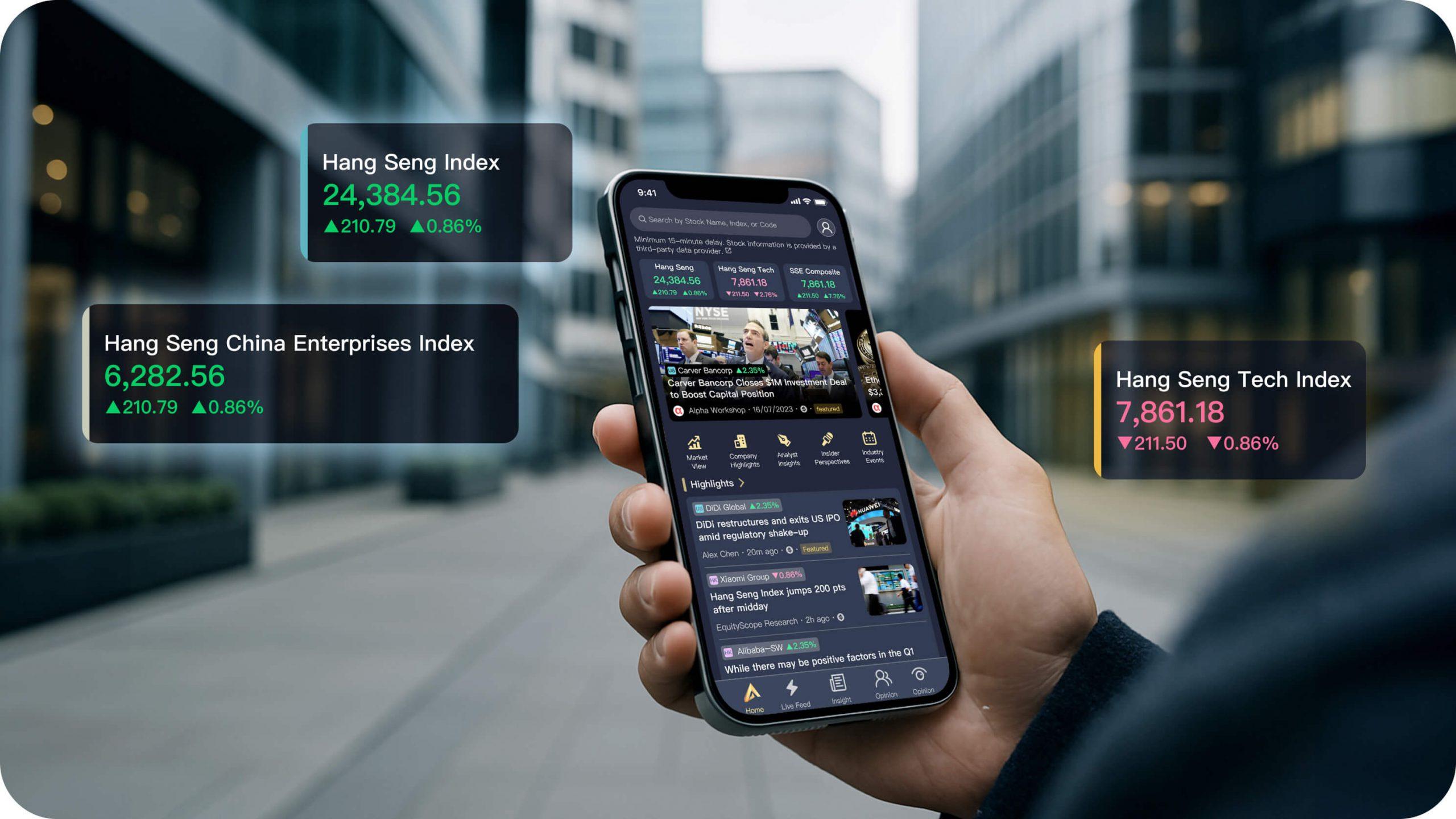
Context-Aware Components. Dual-screen view that integrates news feed with market visualization, showcasing how component patterns support advanced interaction and real-time data correlation.
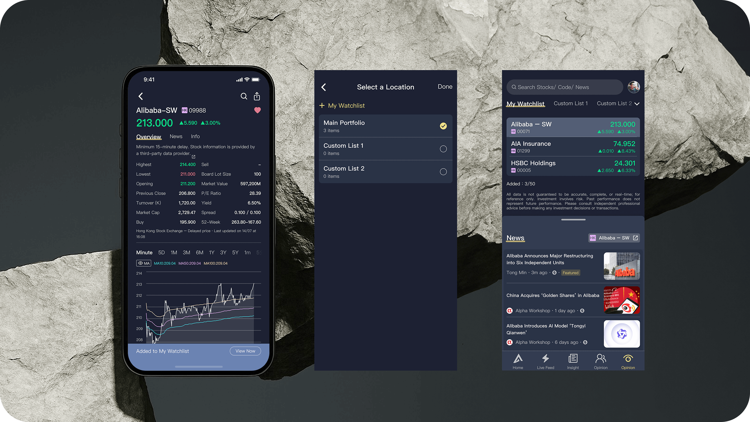
Modular Card System. Watchlist interfaces showing how modular card components and standardized data formatting create fluid movement across the portfolio tracking experience.
DOCUMENTATION ■
The documentation of foundational elements provided clear standards that transformed cross-functional workflows.
This shared visual vocabulary effectively bridged the gap between design and development, creating a common language that eliminated handoff ambiguities and significantly reduced QA cycles.
Designers reported reducing component creation time while gaining greater confidence in design decisions. Developers cited fewer clarification requests and a shift from page-by-page implementation to a more efficient component-driven approach.
■ OTHER PROJECTS ■